Lorem ipsn gravida nibh vel velit auctor aliquet. Aenean sollicitudin, lorem quis bibendum auci elit consequat ipsutis sem nibh id elit dolor sit amet.

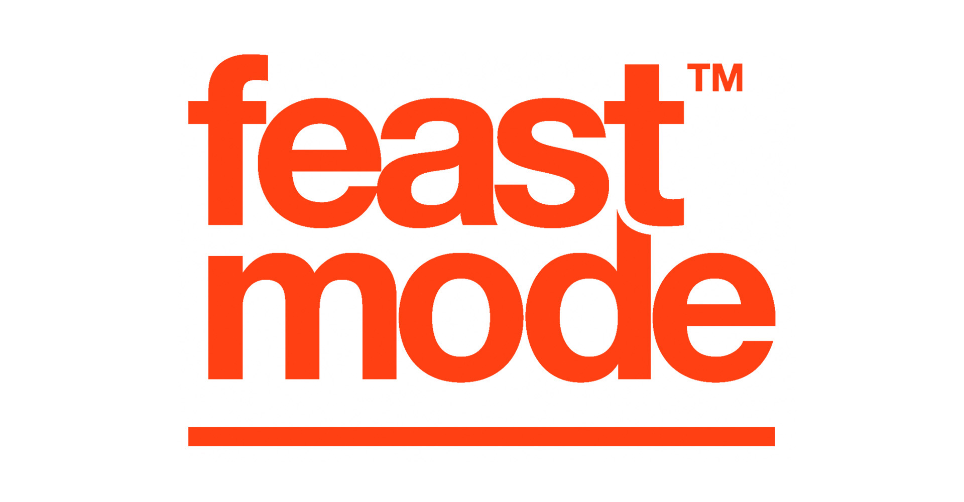


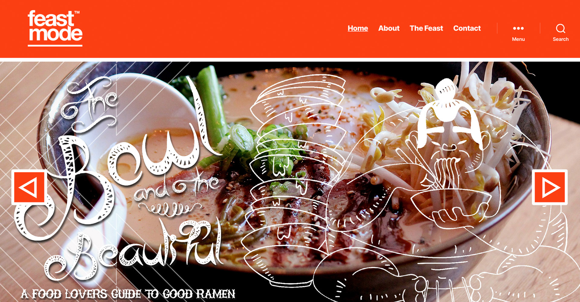
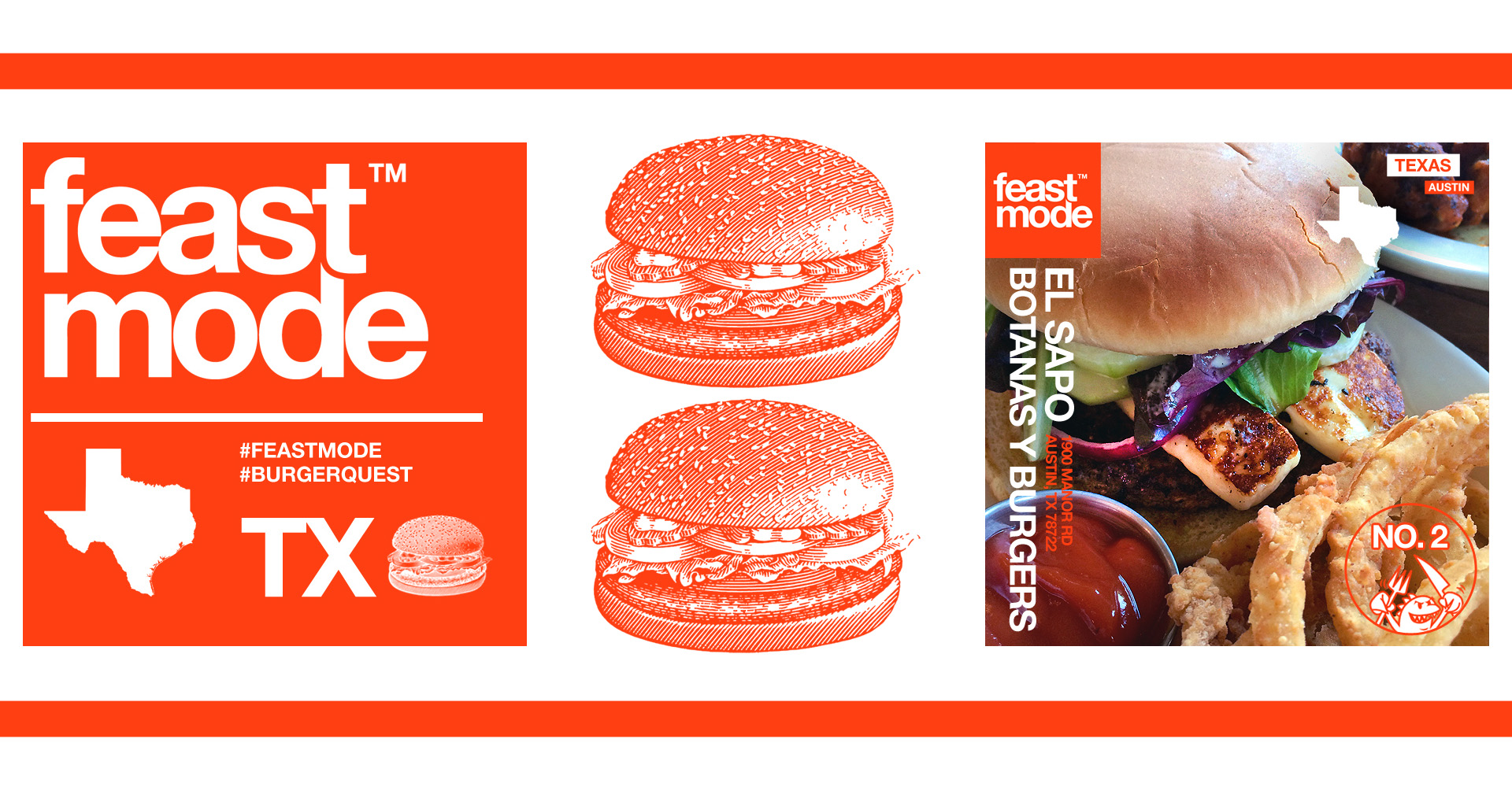
This was my first logo where I not only truly fell in love with HELVETICA, but I truly became aware of the power and finesse of this classic typeface. Feast Mode™ is a unique outfit out of Austin, TX – of which is a major foodie scene, on top of its live music capital of the world status. Although it is no New York City, Los Angeles or Chicago, regarding size and vast array of offerings, it fairs well and stands on its own two feet firmly. With that said, the access to so much good flavor from authentic BBQ, Tacos, Thai, Vegan, fusion food and more is just a food truck / strip mall / festival / pub / luxury restaurant and cart away. Therefore it makes sense that this group of foodies and bloggers got together to create a Top 5 destination site that covers all the best the nation has to offer, with it always starting in Austin and Texas as its ground zero.
During my time in Austin, TX (aka ATX), I was tapped to help this brand develop its identity — and I was super excited for the task. The parameters seemed simple enough, and my mind was racing with concepts, from fun little critters as mascot(s), to big beefy type and crazy colors – I mean with a name like FEAST MODE a play on Beast Mode, how could my mind not go that route. But, here is the interesting part, I received the opportunity to work with fellow creatives and this made my process more streamlined. The team actually surprised me, they wanted a logo that was type focused, and they made it clear “WE WANT A CLASSIC SAN-SERIF TYPEFACE AND / OR TTF” …this was music to my ears.
In the event that you are not aware what a TRUE TYPE FONT (TTF) is, allow me to elaborate – the following is borrowed from Wikipedia: “TrueType is an outline font standard developed by Apple in the late 1980s as a competitor to Adobe’s Type 1 fonts used in PostScript. It has become the most common format for fonts on the classic Mac OS, macOS, and Microsoft Windows operating systems. The primary strength of TrueType was originally that it offered font developers a high degree of control over precisely how their fonts are displayed, right down to particular pixels, at various font sizes. With widely varying rendering technologies in use today, pixel-level control is no longer certain in a TrueType font.”
A Classic typeface sounds pretty much how it sounds… Classic. Classic typefaces, are usually font systems created anywhere from the early 1950’s all the way to early 19th century or even beyond – they are commercial and standard fonts that have been used extensively from print to today’s digital usage. Examples are Clarendon, Times New Roman, Bodoni, Century Gothic, Lucida Sans, Futura, Avant Garde, and many more.
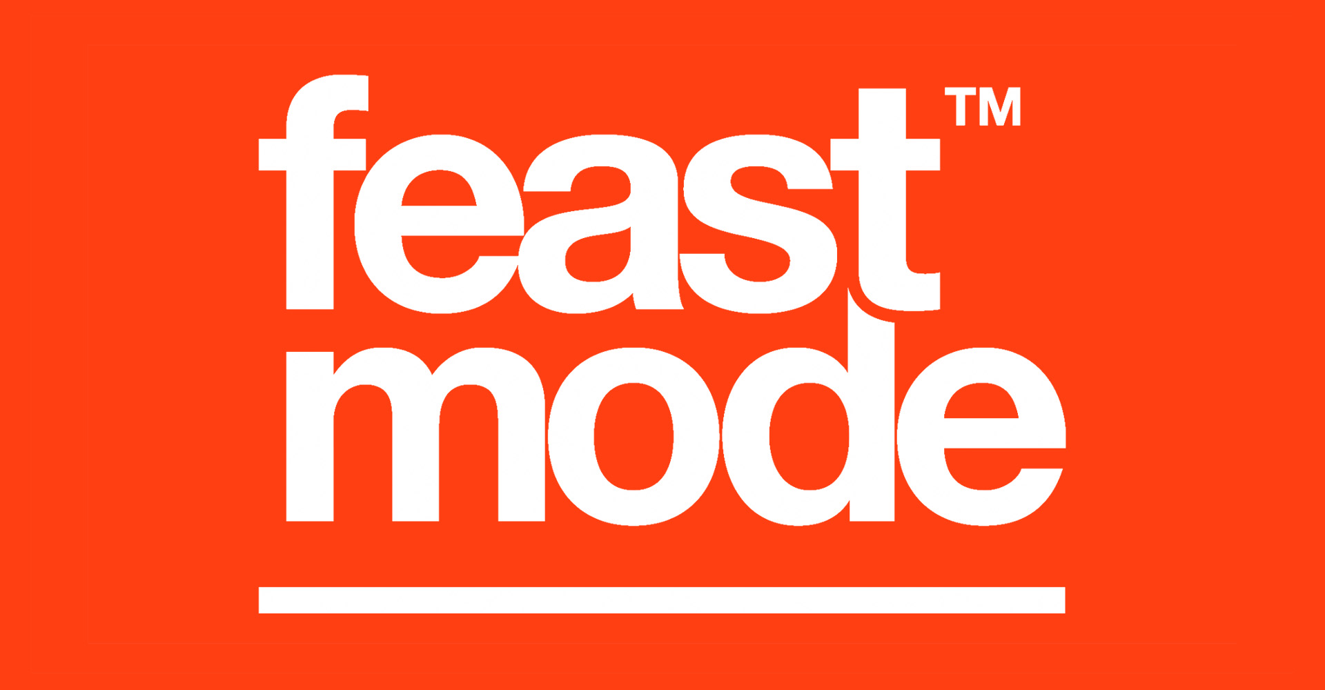
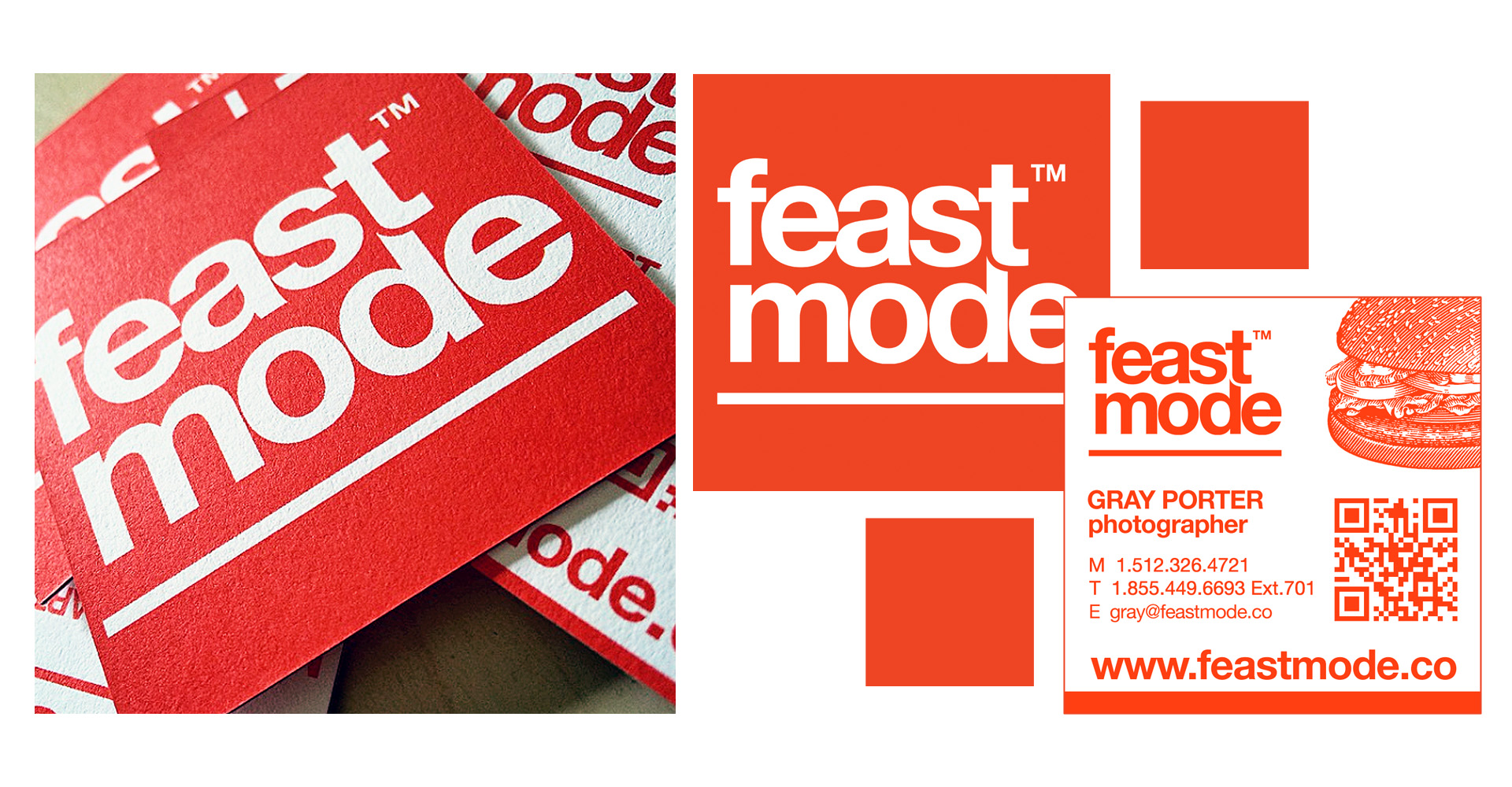
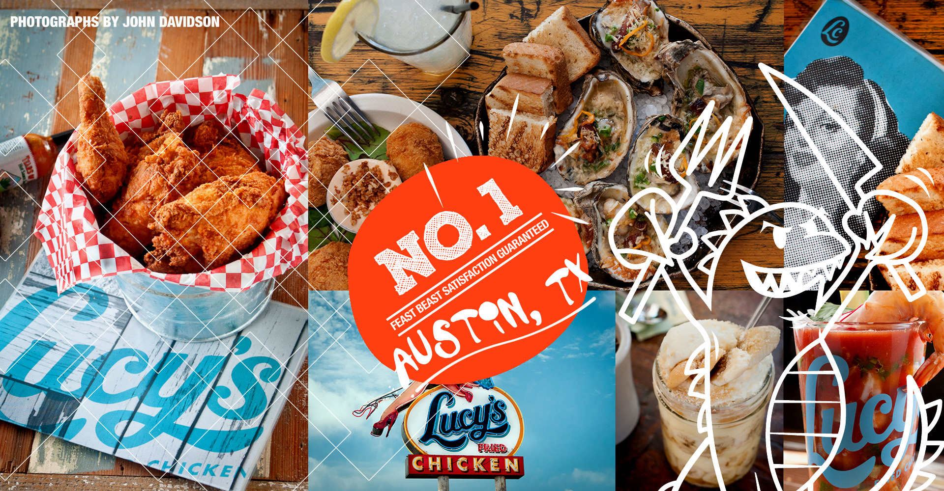
And well… You guessed it, HELVETICA is not only a classic type-face but also a TTF. Aside from the client input, what truly inspired me to go the route of using this unassuming and simple typeface, was the 2007 documentary HELVETICA. This documentary changed my entire perspective on the typeface, and turned this “unassuming” typeface, into a spectacular typeface! To see all the magic that the late great Massimo Vignelli has done with Helvetica, is beyond phenomenal. With a simple juxtaposition, tracking, kerning, or weight change, this typeface can be anything you want it to be depending on the client and the branded application it will serve. For Feast Mode™ it felt right, I wanted the name to command presence, but the wordmark to be soft but structured, clean, balanced, and most of all the perfect weight. The goal was to let the brand identity colors and most importantly let the food photography tell the full story, and through that content it could be loud or manage the volume of its narrative dependent on the subject matter. The end result I feel evokes a lot of the Vignelli design spirit, and it’s tweaked just enough to make it unique in its own right. PLUS side, I got to create a mascot for the brand; anytime I could sneak in a character / mascot, that is always a check-plus for me. The Feast Beast was created to personify the HANGRY attitude one gets when hunger is combined with anger. In conclusion, this was the first logotype project in a long time, where it not only made me hearken back to all of my schooling in the university days, where design theory was king. But, it also allowed me to fall in love with design, type-setting and branding all over again…