Lorem ipsn gravida nibh vel velit auctor aliquet. Aenean sollicitudin, lorem quis bibendum auci elit consequat ipsutis sem nibh id elit dolor sit amet.
Lorem ipsn gravida nibh vel velit auctor aliquet. Aenean sollicitudin, lorem quis bibendum auci elit consequat ipsutis sem nibh id elit dolor sit amet.


Before there was MADE-X-AYCART® (MXA – Made By Aycart), there was once upon a time AYCART STUDIO, a sole proprietorship that specialized in graphic design, custom art and multi-media (I am sure I just dated myself by using the term “Multi-Media”). In between AYCART STUDIO and MADE-X-AYCART®, there was A79, a design consultancy; although brief, it allowed for the evolution of the current branded portfolio website to take place, and it introduced a new form of design for myself, that in prior I was not ready to execute with precision or even in theory.
LOGOS sometimes are like fashion trends, they change so much only to circle back to a time that is nostalgic, or where we simply say “that’s when it was done right.” Having gone through the 80s and 90s, and early 2000s, I’ve seen logos go from a “less is more” presentation, to a grungy, busy, overlayered / textured approach. I partook in all of those “trends”… I feel it was through those years that I lived and learned a lot, and truly found out who I was a designer. Subjectively I like to compare the era of simplicity of Paul Rand, with the maximalist approach of the late 90s from David Carson. These are two opposite of the spectrum designers, that also hail from two very different eras of time; yet it’s through these two opposite masters of design, where I feel I found the perfect niche. What is my perfect niche? It is having that ability to create a clean silhouette and bold logo, where maximalist textures and elements can live within the brand identity system. By participating in these design trends, having lived and executing these design principles, it has allowed me to apply these methods of design based on the clientele and target audience.
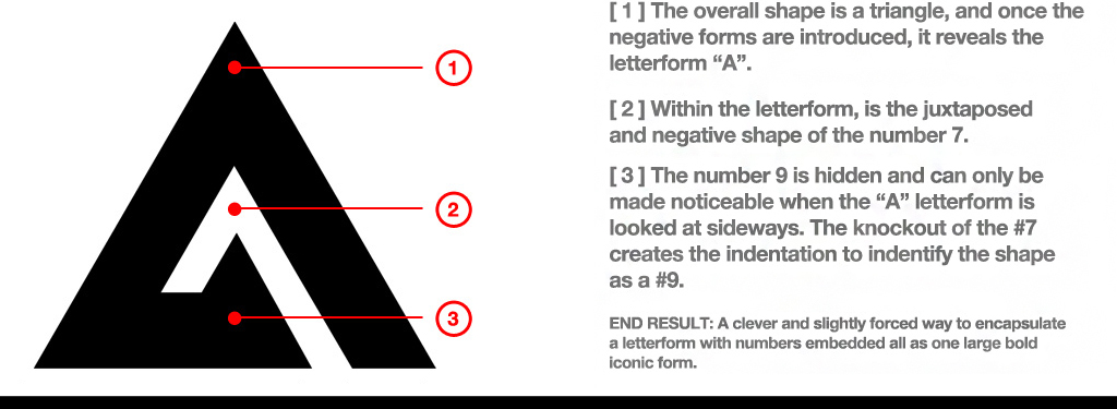
I wanted a quick and simple name for this consultancy, and while I settled for something so simple and essentially mindless – the logotype became quite the challenge. The “A” stood for AYCART my last name, and the 7 and 9, the year I was born. The goal was to integrate all of these elements, for an end result of a simple bold mark, with true form and function all-in-one. At first their were literal attempts, then the other attempts felt sci-fi… Eventually I stopped concentrating on how I could literally embed the numbers into the letter form / shape, and then concentrated on the numbers. Thus, I had to deconstruct the A to its simplest form, and that was by making it a simple precise pyramid – stripping it of its negative shapes and ligature. The 7 was used as a knockout, and after juxtaposing it, and finding the perfect placement, the 7 allowed the 9 to take shape. The 9 may not be immediately evident, but with the placement of the 7, in its angled layout, allowed an agular and abstract 9 to reveal itself when you face the 7 with the “A” in that same angled view.
BEHOLD A79… Maybe its instant, maybe it’s not. I do have to admit that I get my thrills in breaking down this simple looking logotype, and all the clever integrations it hides; there’s nothing like that moment when a client, peer or friend says “Ohhhhhhhh!” — This was my first truly successful self embedded / encapsulated logotype, and it has allowed me to take a new approach to my work. It’s now evident within this portfolio @ GOTHAM GENERAL CARPENTRY and even with ELEKTRIK DREAMS. It still lives within the MADE-X-AYCART® logotype, as an homage to my new found design approach and passion for this craft and industry.
